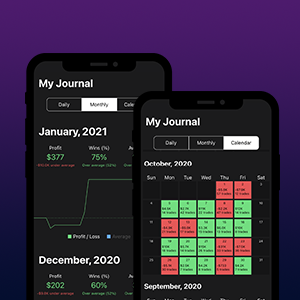
The kinfo Social Trading Journal
Learn more about how you can utilize kinfo as an automated trading journal
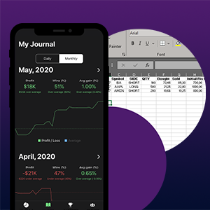
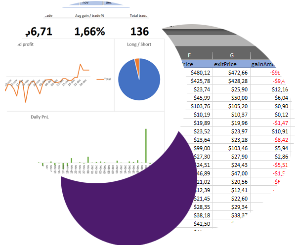
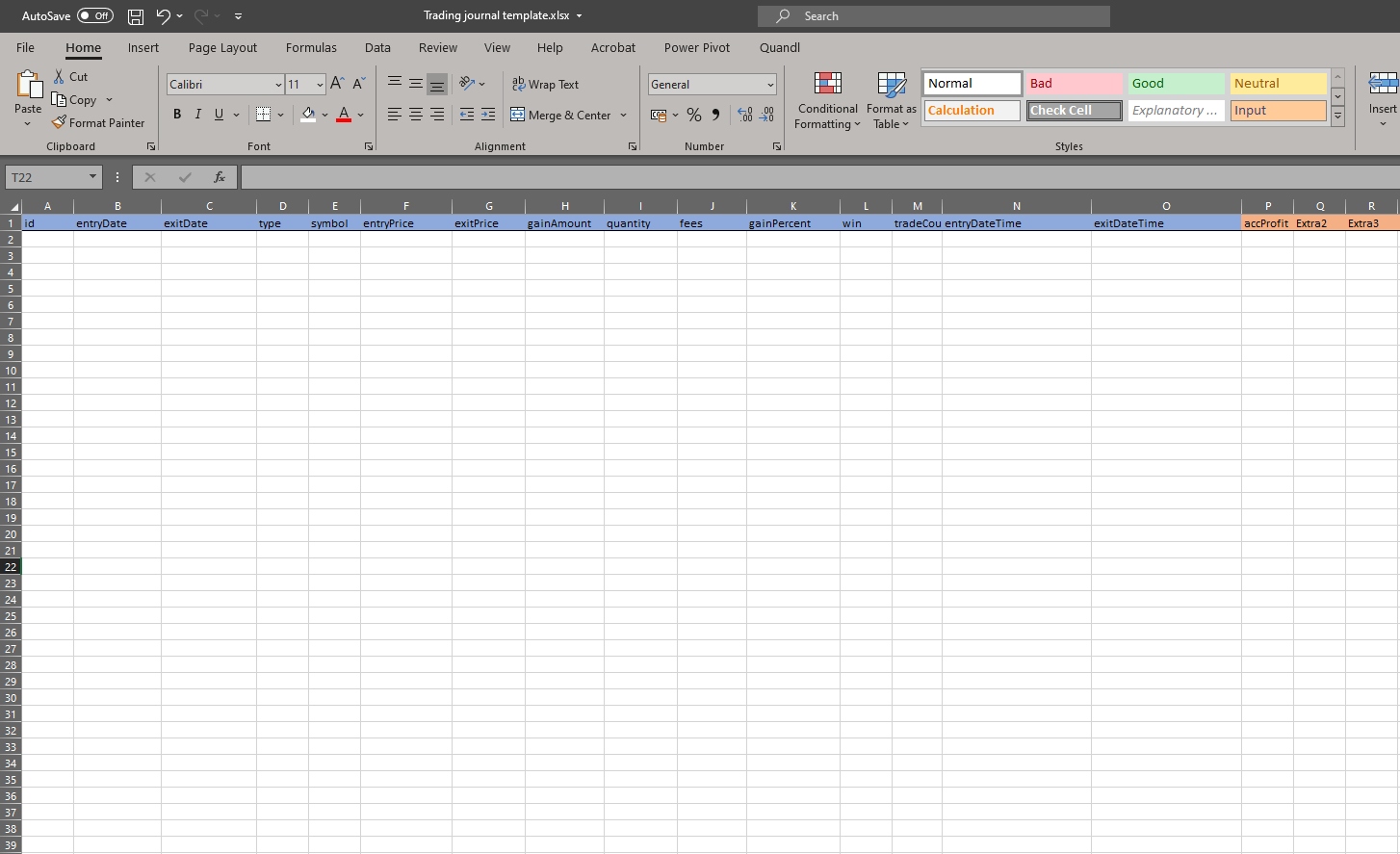
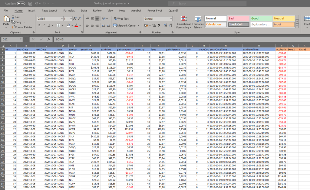
What is a Trading Journal
Learn more about how you can utilize kinfo as an automated trading journal
Learn more about how you can utilize kinfo as an automated trading journal
Learn more about how you can utilize kinfo as an automated trading journal